When starting a new dashboard, it’s beneficial to begin with a summary of the key metrics. While it may not be a visualization that makes it to the final product, using the Gauge Card can help you get a foundation to build your metrics tracking on.
Domo Gauge charts are an easy way to see an overview of a single Key Performance Indicator, or KPI, and with the ability to set goals or benchmarks, you can quickly see where you are in relation to your target. Gauge charts are best when you have a fixed upper bound or when you are measuring a percent or rate. Even if you don’t have an absolute upper bound value, Domo’s Gauge chart automatically adjusts to the value so your range is neither too large nor too small.
Gauge charts are more valuable for dashboards that refresh daily or more often. While it can also be useful on dashboards that update less frequently, the general idea is to be able to glance at it regularly to check your velocity toward your target. If you only check it once a month, there are other chart types that are more informative. You should include a target value of some sort as well – it’s a valuable and easy way to visually indicate progress toward your goal.
Using Domo’s Filled (Gauge) Chart
Domo provides an easy to use Gauge chart. Here is a good way to set one up as well as some things to watch out for.
As mentioned, it’s beneficial to provide a target. This can be done by providing a Target Value chosen from one of your Columns, or it can be configured as a fixed value from the General properties menu. If you want this value to be variable, you should use a Column value – you will likely need to do some planning or provide a calculation to derive the value. For example, you could set the previous year’s value as your target to see how you are tracking against prior performance levels.
A quick visual reference is to set the Color Source within the General properties to be “Green Above Target” as well. This allows for a quick indicator for users to see if they are below or above the target. Labeling the Target and Value within the General properties menu will also provide clarity for the viewer
One specific distinction to the chart is visible when using a derived metric as your value. For example, when calculating a Conversion Rate (such as Cost per Conversion), you should use a single dimension within the “Gauge Name” that will be used for the calculation. Otherwise, your rates will be added together. In this example, there are two accounts that to evaluate the conversion rate on. If the Account dimension is set as the “Gauge Name” without filtering on one of them, the card will sum the Conversion rates:
Expert Automotive cost per conversion = 48.88
National Automotive cost per conversion = 47.74
Total cost per conversion in card = 96.62
If this isn’t value you want, you either need to filter the card on one of the accounts and build two cards to show the value for each account, or the accounts can be grouped by using a simple Beastmode calculation in Domo that will add both accounts together and use that as the filter:
CASE
WHEN `Account` = 'Expert Automotive' THEN 'All'
WHEN `Account` = 'National Automotive' THEN 'All'
ELSE 'filter'
END
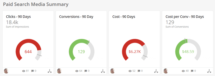
Now the cost per conversion across both accounts will be displayed at 48.59.
Generally, it’s useful to set up a series of Gauge charts that show a summary of several related KPIs. For example, you can show Clicks, Conversions, Cost, and Cost per Conversion each within a separate Gauge on a summary Dashboard to get a sense of how Paid Search media is performing overall.
Visually speaking the Gauge chart is pretty basic, but it provides a good launching pad for Dashboards and more detailed visualizations. When used properly, it sets the stage for telling your story about the data and sets the table for deeper discussions about performance.
comments